We offer variety of affordable design services per project as well as monthly outsourcing packages. Let's get in touch today!
We offer variety of affordable design services per project as well as monthly outsourcing packages. Let's get in touch today!
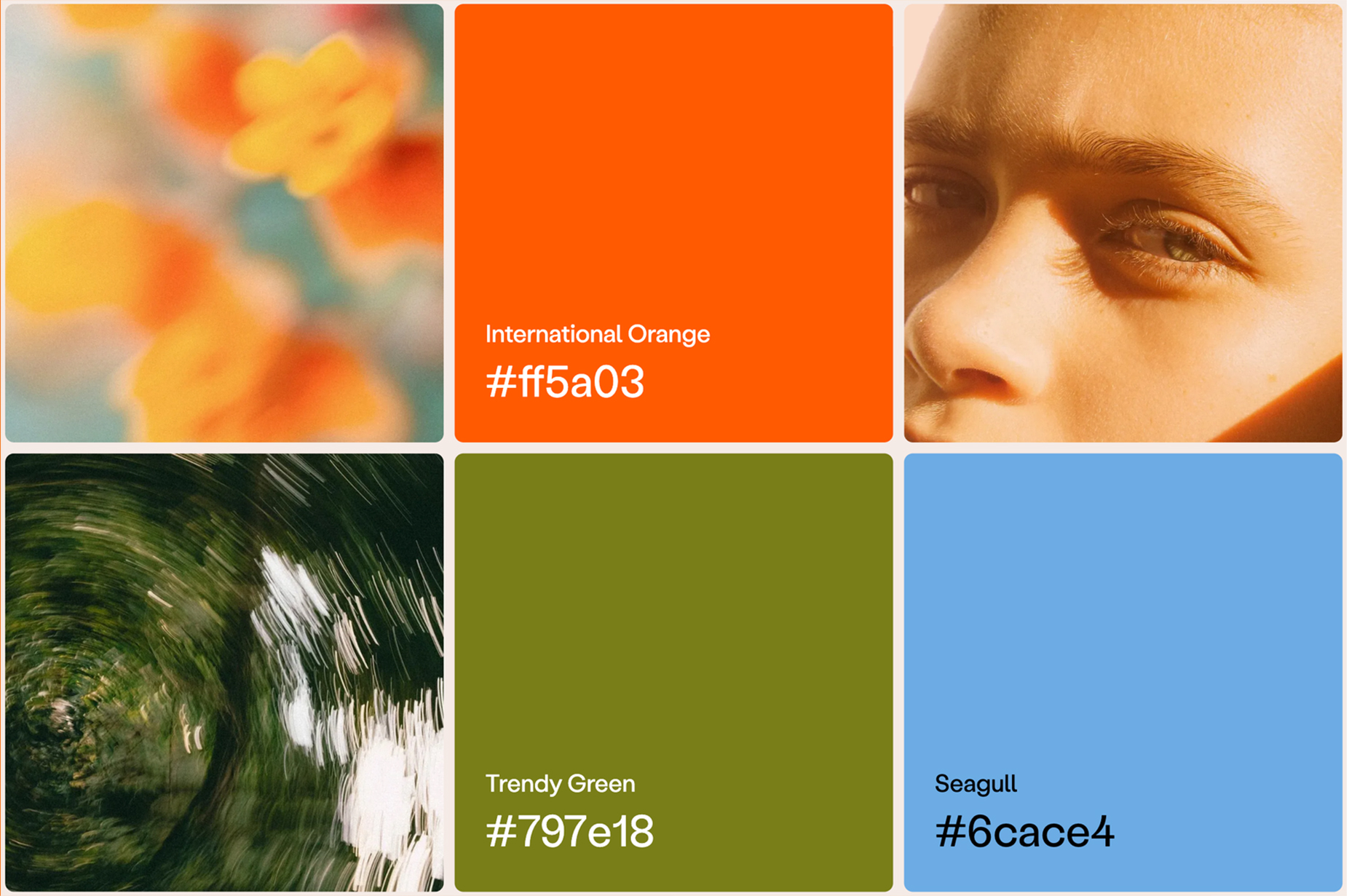
Color isn't just an aesthetic choice — it's a strategic tool that shapes how your audience perceives your brand. The right color palette can evoke trust, excitement, or elegance, while the wrong one might confuse or alienate potential customers. Understanding color psychology and applying it thoughtfully can transform your brand identity.
Colors carry psychological meanings that influence perceptions and behaviors. For instance, blue often conveys trust and professionalism, making it a popular choice among tech and financial companies. Red can evoke energy and urgency, which is why it's frequently used in the food and retail industries. Green is associated with health and nature, suitable for eco-friendly and wellness brands. Yellow radiates optimism and attention, while black denotes sophistication and luxury.
Recognizing these associations helps you select colors that align with your brand's values and the emotions you wish to evoke.
Consider your brand as a person. Is it professional and reliable, fun and energetic, elegant and exclusive, or natural and approachable? Your brand's personality should be reflected in its color palette. For example, a law firm might choose a palette of navy blue and gray to convey trust and professionalism, while a children's toy company might opt for bright colors like red and yellow to appear playful and inviting.
Different industries have established color norms that your audience subconsciously expects. For example, technology and finance brands often use blue and gray to convey trust and stability. Food and beverage brands frequently use red and yellow to stimulate appetite and attention. Luxury goods brands often rely on black, gold, and silver to suggest exclusivity and high-end quality. Health and wellness brands lean toward green and white, symbolizing cleanliness and vitality, while children's products thrive with bright primary colors like red, blue, and yellow to feel engaging and cheerful.
While it's important to stand out, aligning with industry expectations can help your brand feel familiar and trustworthy.
A strong brand identity rarely relies on a single color. A well-structured palette typically includes a primary color, which dominates your brand’s visuals; secondary colors, which complement the primary shade and provide variety; and accent colors, which offer contrast and highlight important elements such as call-to-action buttons or key messages.
Experimenting with color wheels or palette generators can help you find harmonious combinations and ensure your colors work well together.
Colors can appear differently across various mediums and lighting conditions. It’s crucial to test your chosen palette on multiple platforms, including websites, social media, and print materials, to ensure consistency and effectiveness. Observing your colors in different contexts helps you refine the palette until it feels balanced and visually appealing.
Coca-Cola’s iconic red stimulates energy and excitement, encouraging engagement and impulse action. Starbucks’ green evokes calm and a connection to nature, aligning with its brand ethos. Tiffany & Co.’s distinctive blue signifies luxury and exclusivity, making the brand instantly recognizable.
Finding the perfect colors for your brand is not about picking your personal favorites—it’s about selecting shades that resonate with your audience and reflect your brand’s personality. By carefully choosing, testing, and refining your palette, you can create a visual identity that builds recognition, trust, and lasting impact.
From logos to complete brand strategies, we create identities that capture your story and connect with your audience.