How to design a responsive logo that works at every size
Your logo doesn't live in one place anymore.
It appears on a billboard and in a browser tab. On a storefront sign and on a smartwatch screen. On a printed brochure and as a 32-pixel social media avatar. One version can't do all of that well. That's why strong brands use responsive logos.
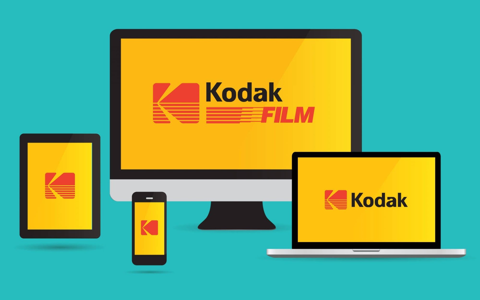
What Is a Responsive Logo?
A responsive logo is a set of logo versions designed to adapt to different sizes and spaces. As the available space gets smaller, the logo gets simpler, while staying recognizable as the same brand. It's the same idea as responsive web design: one identity, adjusted for every screen.
Why One Logo Isn't Enough
A detailed logo that looks great on a website header can turn into an unreadable smudge as a favicon. Thin lines disappear, small text blurs and fine details merge together. On the other hand, a tiny icon used on a large banner can feel empty and disconnected from the brand. Responsive logos solve both problems.
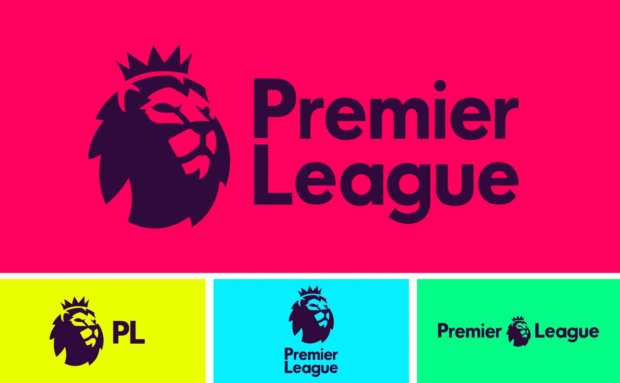
The 4 Typical Logo Versions
Most responsive logo systems include some or all of these:
1. Primary Logo
The full version, often with a symbol, wordmark and sometimes a tagline. It's used where you have the most space: website headers, signage, presentations and print.
2. Secondary Logo
A simplified or rearranged version, for example a horizontal layout instead of stacked, or the tagline removed. It works in tighter spaces like email signatures, social headers and narrow banners.
3. Wordmark
Just the brand name in its custom typography. Useful when the symbol isn't needed or when the name itself needs to do the work.
4. Icon or Monogram
The smallest and simplest version: a symbol, initial or monogram. It's used for favicons, app icons, social media profile pictures and small merchandise.
How to Design a Responsive Logo
Start With the Smallest Version in Mind
Even when designing the primary logo, test early how it will look at 16 or 32 pixels. If the core idea doesn't survive at small sizes, simplify it now.
Keep One Recognizable Element
Every version should share something: a shape, a letterform or a color. This is what connects the full logo to its smallest icon.
Remove Details Step by Step
With each smaller version, remove what isn't essential: the tagline first, then secondary details, then the wordmark. Keep only what makes the brand recognizable.
Adjust, Don't Just Shrink
Small versions often need thicker lines, wider spacing between letters and simpler shapes. Scaling the primary logo down is rarely enough.
Test in Real Contexts
Place every version where it will actually be used: a browser tab, a phone home screen, a business card, a building sign. What works on a design canvas can fail in real life.
Document the Rules
Your brand guidelines should show each logo version, when to use it, minimum sizes and clear space. Without rules, people will pick whichever version they find first.
Common Responsive Logo Mistakes
- Creating versions that look like different brands
- Simply scaling the primary logo down instead of redesigning it
- Keeping small text in the icon version
- Forgetting single-color and reversed (white) versions
- Not defining minimum sizes in the brand guidelines
- Only testing on a large screen
Final Thoughts
A logo has to work everywhere your brand appears, from the largest sign to the smallest screen. A responsive logo system makes sure it always looks intentional, never squeezed. Design your logo as a system, not a single image. At Brandbusters, we design logo systems that stay clear and recognizable at every size and on every platform.