We offer variety of affordable design services per project as well as monthly outsourcing packages. Let's get in touch today!
We offer variety of affordable design services per project as well as monthly outsourcing packages. Let's get in touch today!
Your logo is more than just a design — it’s the face of your brand. It tells people who you are, what you do, and what you stand for, often in just a single glance. A well-designed logo builds trust, communicates professionalism, and helps you stand out in a crowded market.
But not all logos are created equal. There are several types of logos, each with its own strengths and best-use cases. Understanding these categories is key to making the right choice for your business.
Let’s break them down.

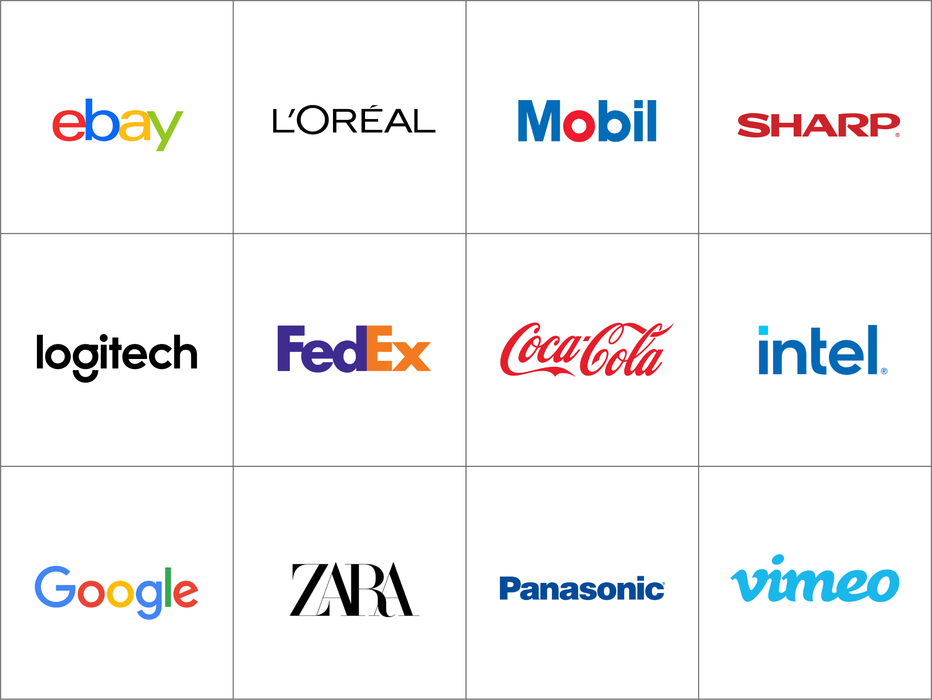
Definition: A wordmark logo consists of the brand name styled in a unique, visually distinctive way using typography alone — no symbols or icons.
Famous examples: Google, Coca-Cola, eBay
Why it works: Wordmarks are clear and direct. They put the focus squarely on your business name, which can be a big advantage when you’re building brand awareness.
Ideal for:
Design tips:
Definition: A lettermark, or monogram logo, is built from the initials of a company name. It’s a streamlined, shorthand version of your brand identity.
Famous examples: IBM, HBO, CNN, NASA
Why it works: Lettermarks simplify long or complex names into something more digestible and memorable. They're also often easier to use in tight spaces (like app icons or favicons).

Ideal for:
Design tips:
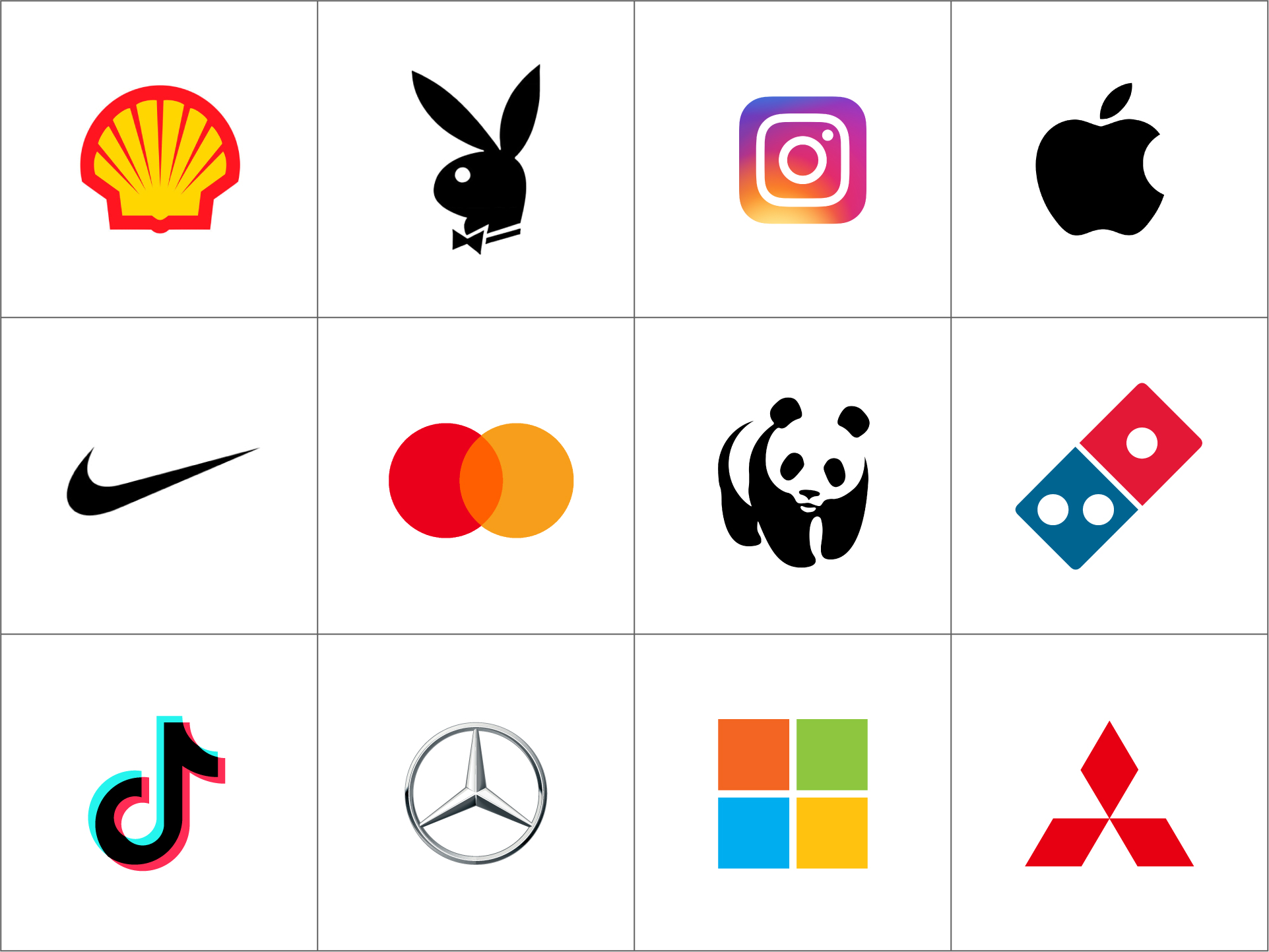
Definition: Brandmarks use a graphic icon or symbol only — no words, initials, or letters.
Famous examples: Apple, Twitter, Target
Why it works: A well-designed icon can become a powerful, universally recognized symbol. Think of how Apple’s logo appears without any need for explanation.
Ideal for:
Design tips:
Definition: A combination mark blends a wordmark or lettermark with a symbol or icon. The elements can be stacked, side-by-side, or integrated.
Famous examples: Adidas, Dropbox, Burger King, Mastercard
Why it works: This type of logo offers flexibility. You get the clarity of text and the visual memorability of an icon — perfect for new brands still building awareness.

Ideal for:
Design tips:
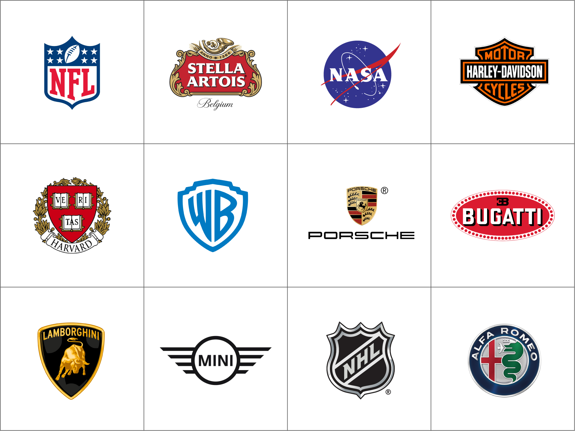
Definition: Emblems incorporate text inside a symbol, badge, or crest. They often have a more traditional or official look.
Famous examples: Starbucks, Harley-Davidson, NFL
Why it works: Emblems communicate authority, legacy, and trust. They’re commonly used in education, government, and industries where tradition is valued.
Ideal for:
Design tips:
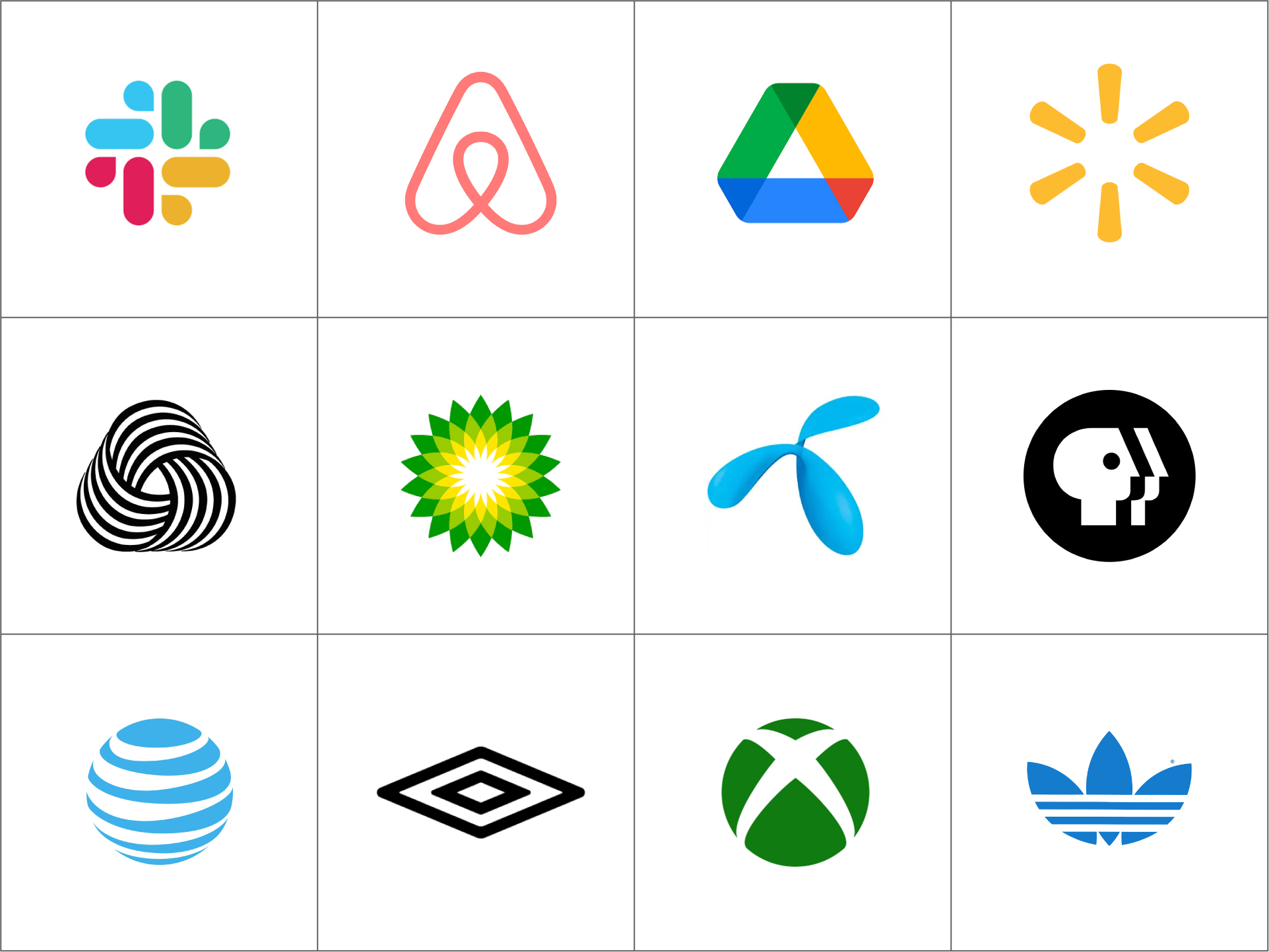
Definition: Abstract logos use shapes, forms, or patterns that don’t directly represent a recognizable object. They aim to express a feeling or concept rather than something literal.
Famous examples: Nike, Pepsi, Airbnb, Spotify
Why it works: Abstract marks are unique and versatile. Because they don’t reference a specific image, they can be interpreted in different ways — and adapted to many uses.
Ideal for:
Design tips:
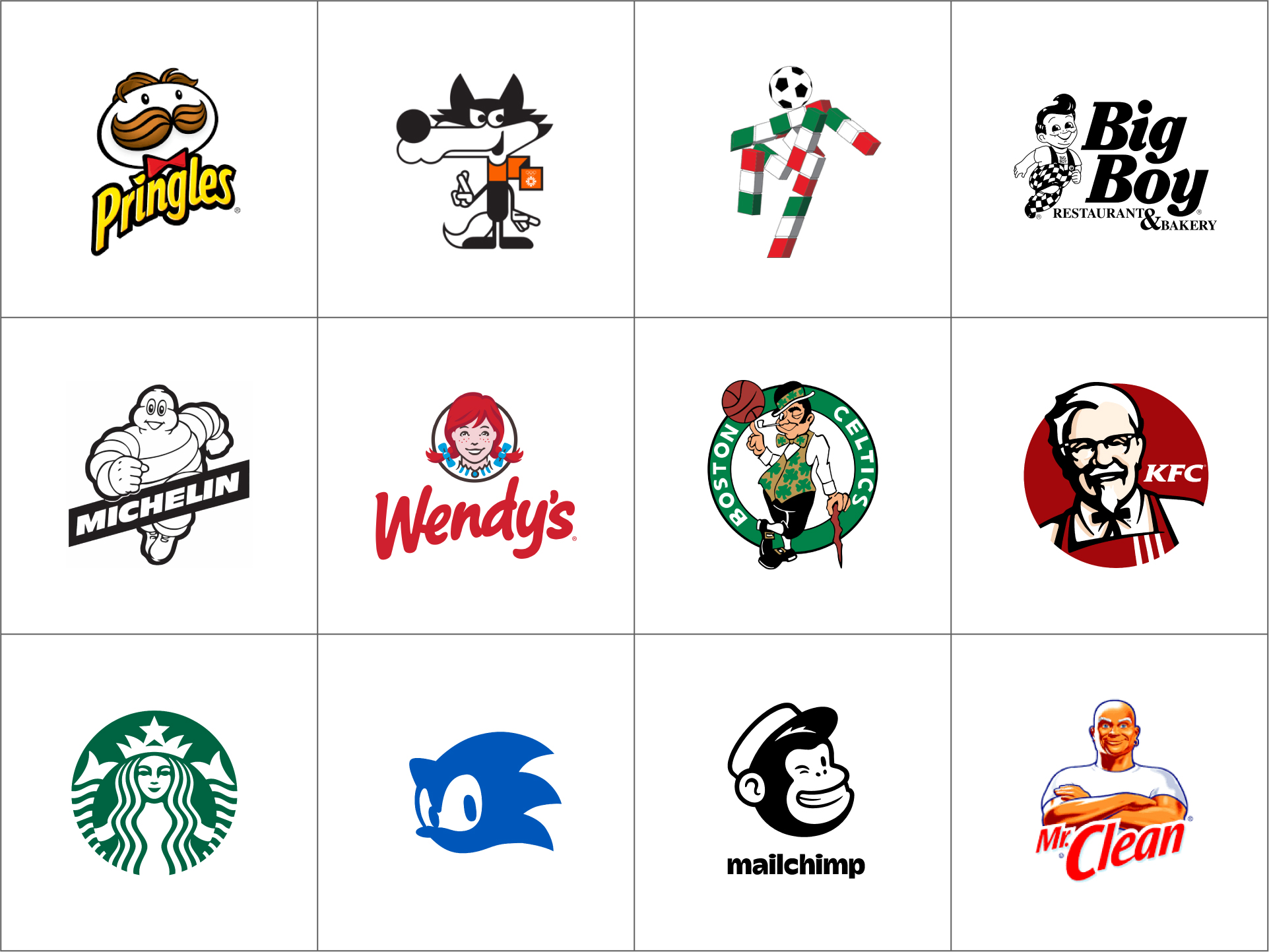
Definition: Mascot logos are illustrated characters that represent the brand — a literal face of the company.
Famous examples: KFC’s Colonel Sanders, Mr. Peanut, the Michelin Man
Why it works: Mascots are personable, fun, and memorable. They’re great for humanizing a brand and creating emotional connections with customers.
Ideal for:
Design tips:
Here are a few questions to help guide your decision:
Still unsure? That’s what designers are for.
Here are a few questions to help guide your decision:
Your logo is a key building block in your brand identity. It needs to be memorable, meaningful, and functional across every touchpoint. Whether you go for a sleek wordmark or a bold mascot, the right logo will help you connect with your audience and tell your story.
At Brandbusters, we help businesses craft visual identities that stand the test of time. Whether you're launching a new brand or refreshing an old one, our team can guide you through every step of the process — from strategy to sketches to final delivery.
Get in touch and let’s make it happen.